Skip to content
gpstudio
Projects
Studio
Contact
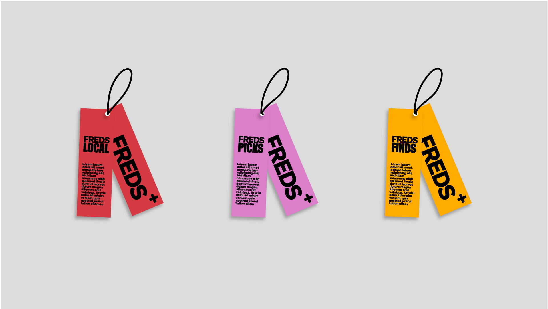
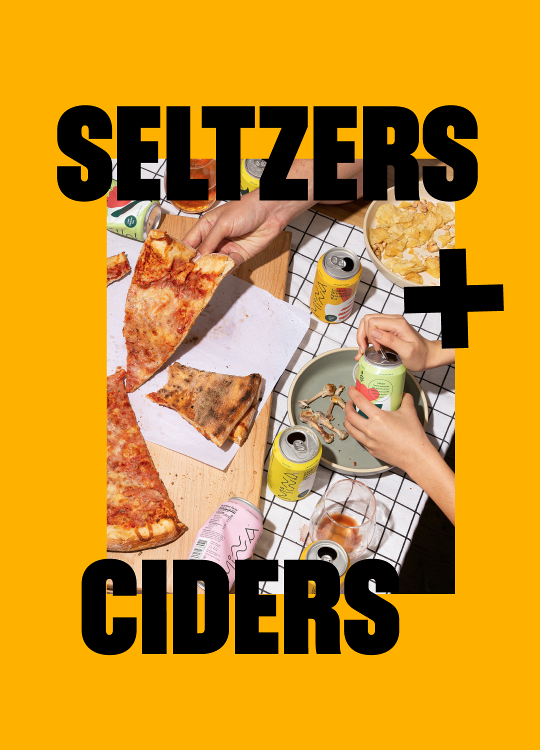
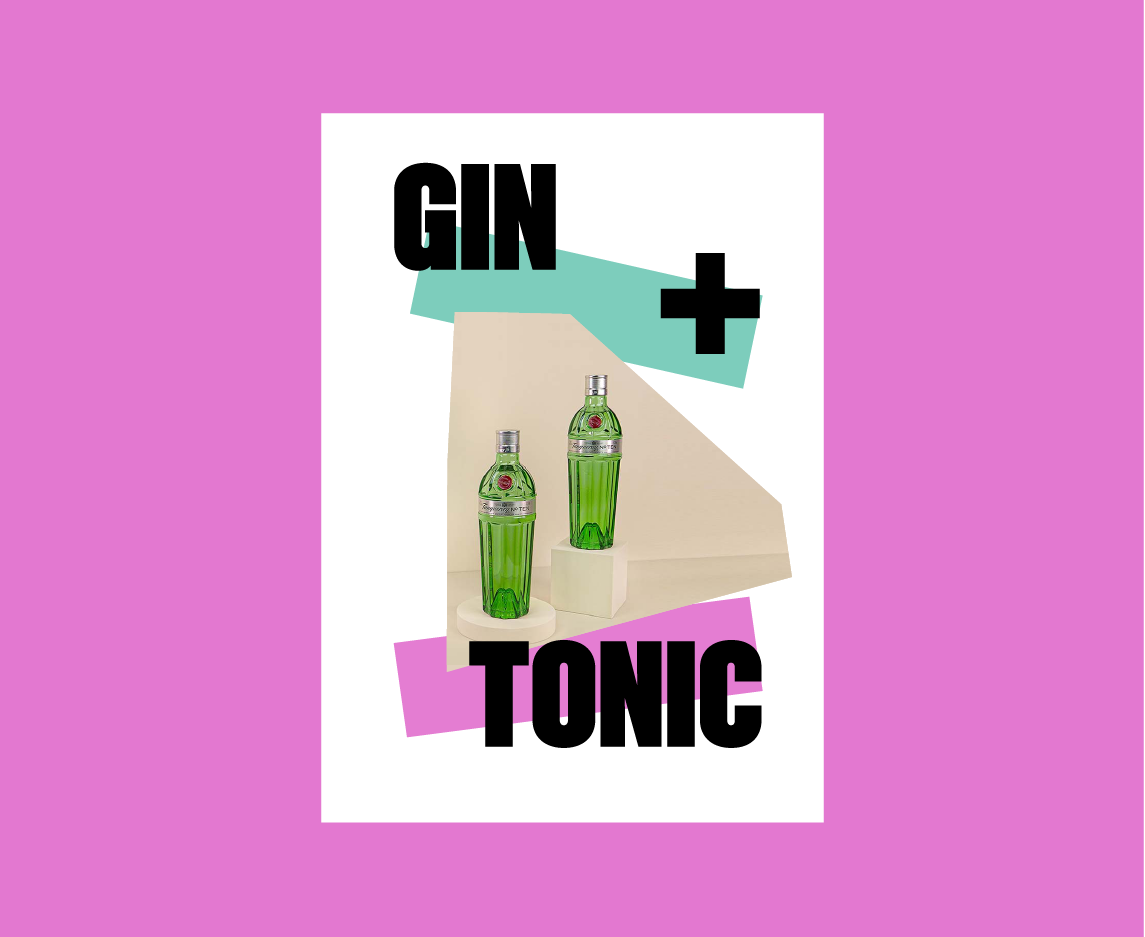
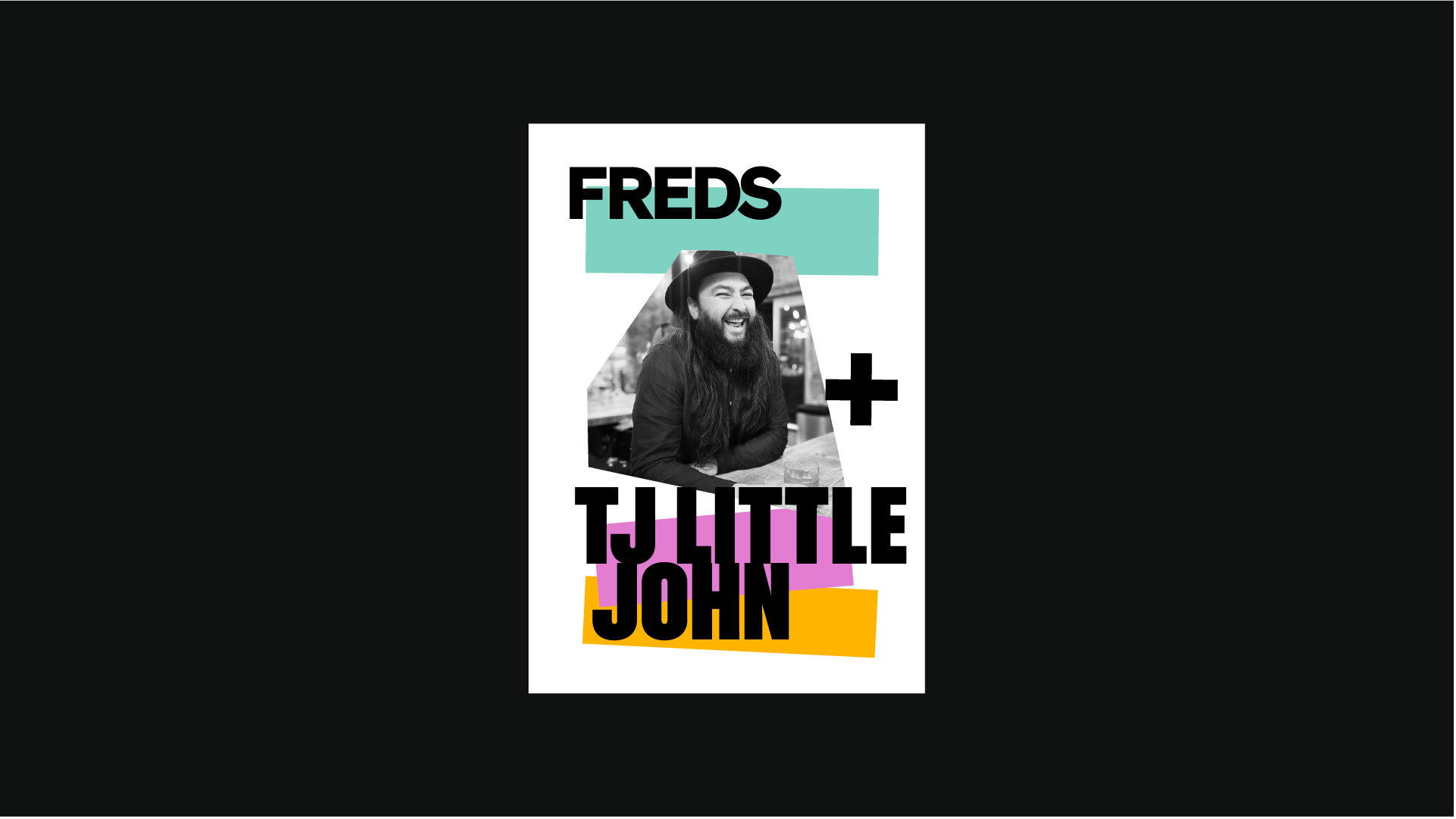
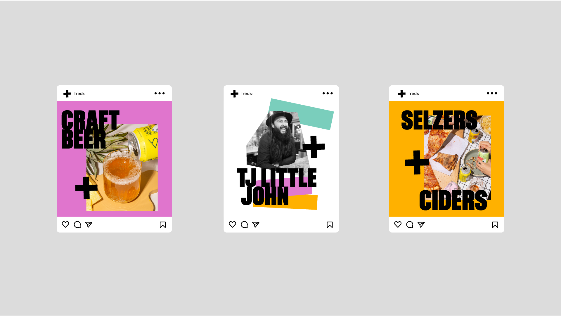
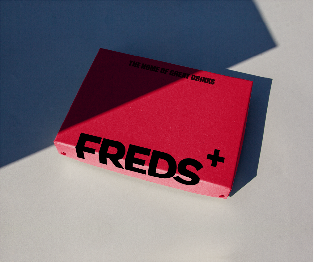
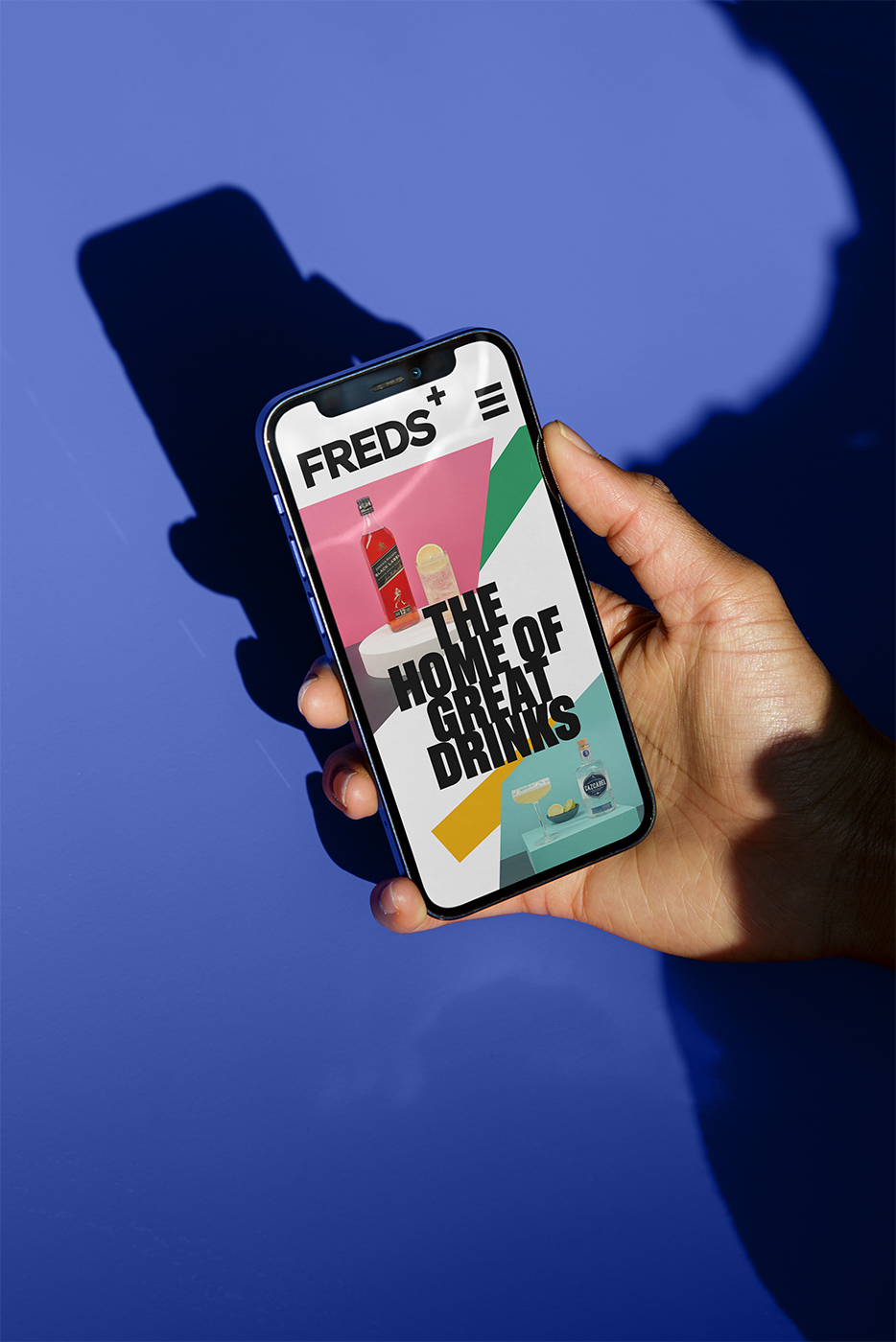
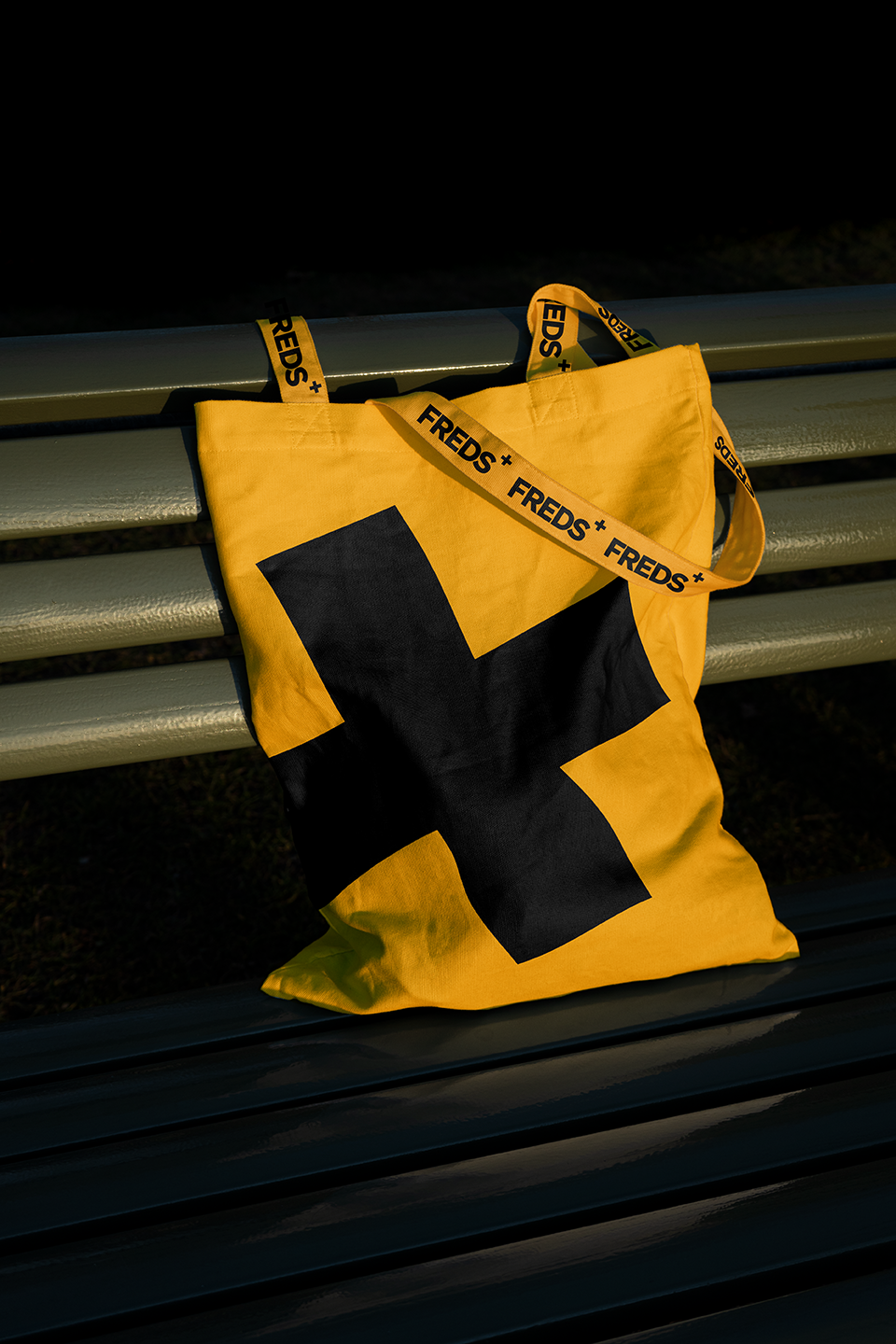
Freds Drinks
Freds Drinks